PUSHING THE PRESS
Curated by Steve Child and David Mayes
Exhibition design and promotion by the USC Roski Special Projects Class. Logo design by Jenisa Keovichit.

As part of the Special Projects in Design Class at the University of Southern California, my peers and I were tasked with designing an exhibit that was the brainchild of David Mayes, a sales representative at TypeCraft - a favored designer-friendly printer who has worked with Southern California cultural institutions such as LACMA, MOCA, the Hammer Museum, CalArts, Art Center, and Otis, in addition to designers and artists such as Shepard Fairey, Robbie Conal, Michael Bierut, and April Grieman.
The exhibit features over 15 years' worth of pieces from over 600 designers in a library-like setting where visitors are encouraged to go up to and physically handle the work.

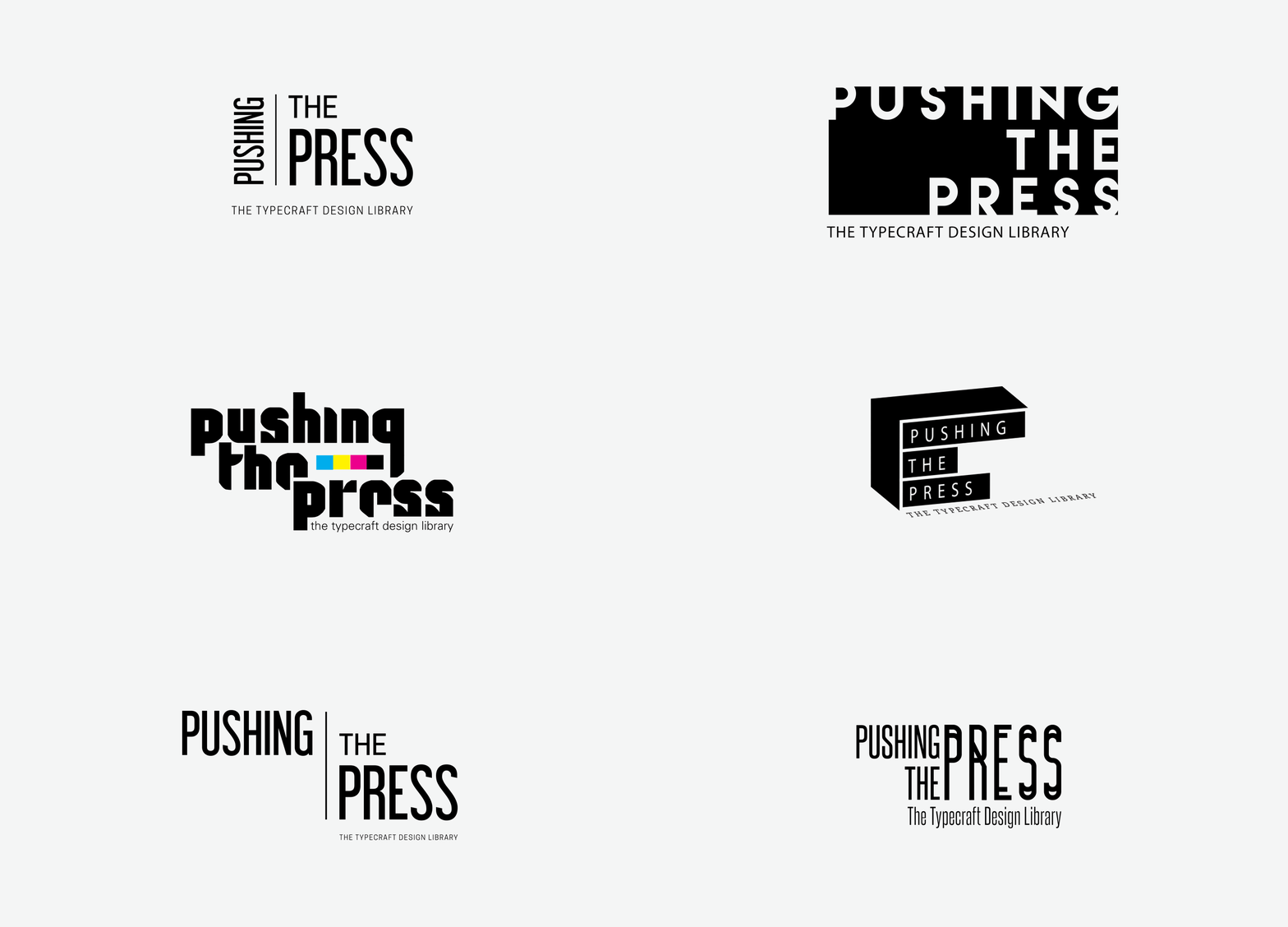
Initial Logo Comps
Each designer in the Special Projects class came up with their own various designs which we then pitched to our clients, which included David as well as Tibbie Dunbar (the executive director of the A+D Museum), Amita Makdani (from M+R Studio, an interior architecture and design firm), and others who were involved in the production of the exhibit.
Although we initially worked individually, there were some core concepts/values that we all agreed upon. We brainstormed several qualities that we wanted the work to have or embody:
STRONG, CRISP
BOLD
LEGIBLE, MINIMAL
CONTEMPORARY
PROGRESSION / MOVEMENT
COMMUNITY
HISTORICAL / TECHNICAL (I.E. REFERENCE TO PRINTING TECHNIQUES)

Chosen Design
I was fortunate enough to have my design chosen for the exhibit. This particular logo was inspired by the idea of motion (both in the printing process and in forward-thinking design), printing techniques such as die cutting, and the juxtaposition between the rich past of the printing process and the advancement of printing processes and technologies that have been and will be developed.
The logo was designed to complement the featured works and not overwhelm or distract from them; however, it is still bold and strong enough to stand on its own. The crisp and clean lines are contemporary and minimal, speaking to an attention to detail and precision, while the serif font evokes a sense of history, timelessness, and elegance.
The color palette elaborates on this story of the meeting of past and future - the slate grey is neutral and modern; the soft black is bold, powerful, and timeless; and the punch of red is bright, lively, and vibrant.
The concept behind the rest of the exhibit identity was showcasing the artists' work without focusing on a particular design as well as continuing to embody a sense of movement and forward-thinking. From the logo, we then went on to design the layout of the exhibit itself as well as all of the design collateral, including promotional materials (postcard, video, and email blast/announcement), a banner detailing all of the names of the featured artists, the front title walls, feature walls, and museum labels.


Comment Wall
This particular feature wall was made up of various comments collected from designers whose work was shown in the exhibit. Comments included thoughts from designers featured in the exhibit on their own works as well as on design, printing, the creative process, as well as the Los Angeles design community.


FEATURE WALLS
Because of the large number of works featured, we had to devise a system of classifications in order to organize all of it. A core aspect of the exhibit was to showcase and educate visitors about all of the various printing processes and technologies available, so we decided to organize the works by process of special techniques - embossing, foil stamping, die cutting, split fountain, special papers, binding, etc.
However, because many of these techniques are tactile, we also wanted to allow visitors to walk up to and physically interact with the work. Thus, a library setting was designed where works were filed according to the artist/designer's names and grouped according to printing technique. Small tables and seating areas were also provided in order to facilitate deeper exploration into featured works.


Opening Night Reception


Live Screen Printing by Hit + Run
The live screen printing portion of the exhibit gave guests a fun activity that allowed them to experience firsthand some elements of the printing process. Attendees personally interacted with the screen printing process on-site, mixing and matching pre-made designs to create unique pieces of art.


For a more in-depth look at the exhibit and the process behind it, click here!