ZYMPTOMSS
Launched in 2017, zymptomss is an online fashion boutique based in Bangkok, Thailand. The brand offers a curated collection of clothing, shoes, and accessories that skew toward a contemporary and trend-led aesthetic. The zymptomss customer is fashion-forward and up-to-date with the latest trends, gravitating toward a style that is classic and feminine while retaining a young, fashion-forward edge.

The guiding concept for the design was to embody a contemporary, high-street fashion aesthetic that was luxe and feminine while also allowing for elements of casualness, play, and approachability - upscale yet accessible. The look and feel of the brand needed to be classic and clean but without venturing into a more sterile modern look.

The name zymptomss is a playful reference to the idea of a "fashion addiction" or a "shopaholic," and some of the challenges in developing the logo were to reference this while avoiding any negative associations in addition to making sure that the visuals signified high-street fashion rather than healthcare.
The logo needed to be clean and unadorned in order to not detract from the clothes but also have a strong enough personality to be able to stand on its own. This was accomplished through the design of both a wordmark and logomark that can be used separately or in combination with each other, allowing for flexibility and consistency throughout all design collateral.

For the wordmark, the brand name was laid out in Linotype Didot - a classic, elegant serif evocative of high-end luxury fashion. The zymptomss wordmark was set in lowercase and italics to cultivate a more approachable and young feel as well as to create a bit more balance in regards to the y height of the wordmark itself. This was teamed with a secondary font, Brandon Grotesque - a contrasting, practical sans-serif whose geometric forms work well with the geometric lines of the logomark.
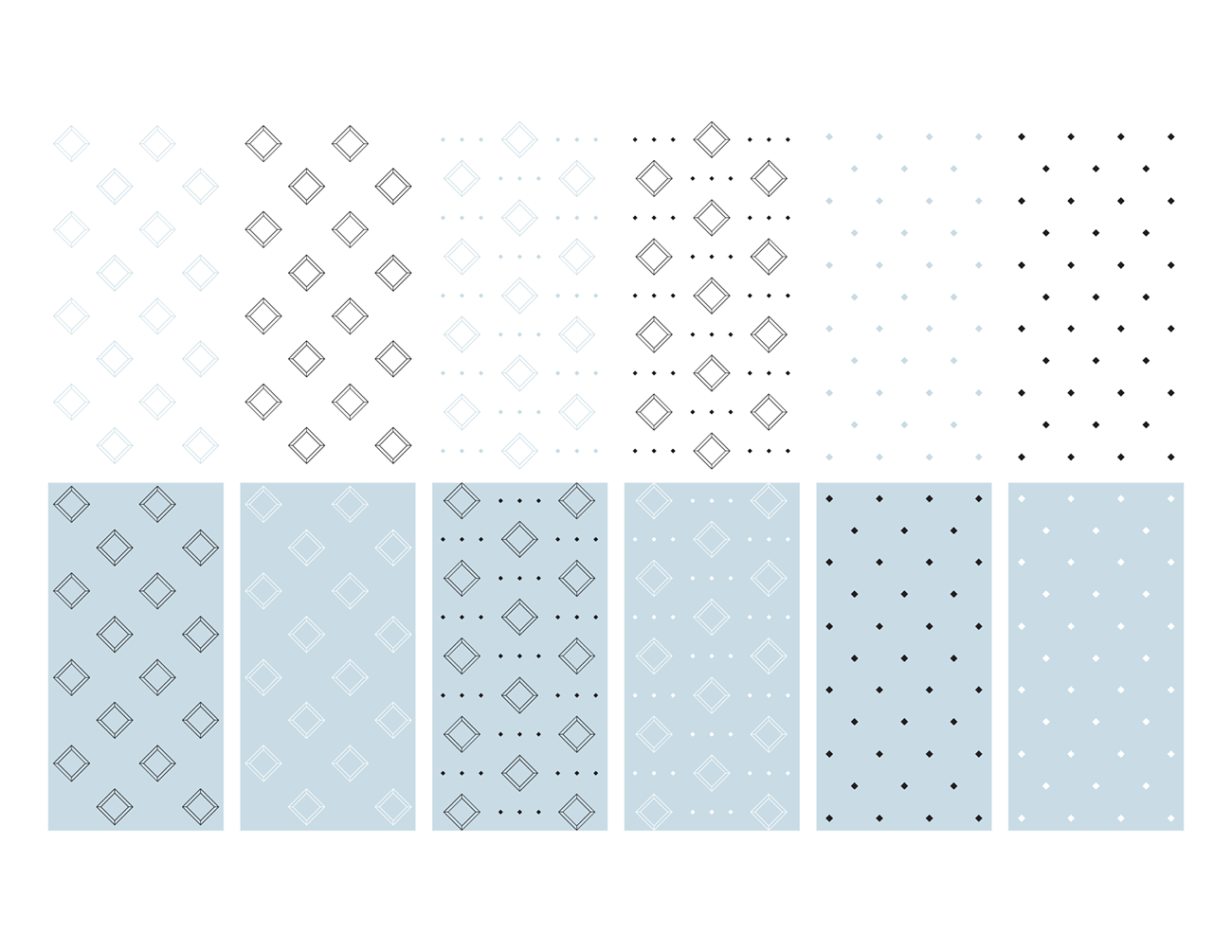
The subtle reference to healthcare came through in the design of the logomark, which consists of a capital Z set in Linotype Didot centered in a geometric diamond shape. The logomark and custom patterns were loosely inspired by a diamond/jewel shape as well as the layout and design of chemical structures and molecular geometry. This idea was elevated by updating the traditional hexagonal shape to a diamond shape, which evokes a sense of luxury and attention to detail. The mono-weight diamond was designed to be open and minimal, and the splash of icy blue gives it a bit more presence and personality.


Keeping with the clean and contemporary style of the logo, the color palette was also kept quite minimal with an icy, pastel blue, bringing a sense of lightness, subtle femininity, and playfulness to the brand. The stark, clean lines of the logo contrast nicely with this softer blue, which is tempered with touches of black, white, and silver in order to keep the design looking modern and sophisticated rather than reading too young or sweet.


As of now, zymptomss sells exlusively through social media, primarily through Instagram. To meet this need for a stronger digital presence, custom Instagram templates were created largely utilizing the zymptomss color palette and custom patterns. These templates and elements may be built on and adapted for additional posts or platforms. As the brand expands, these will allow for consistency in style, tone, and voice.

